
End to end B2B AI analytics platform design, from UX/UI to a 0→1 design system and data visualization
10x
faster new dashboard views (days not weeks)
10 chart
types standardized, zero rework
5 core
product surfaces shipped in 14 weeks
Client
Causal Foundry
Year
2024
My Role
Lead Product Designer
Team
1 Software engineer
1 Front end dev
1 Data scientist
Timeline
14 weeks
Overview
I led design from 0 to 1 for a B2B analytics platform used by healthcare NGOs to send interventions and track outcomes. With no existing product, patterns, or shared design language, my scope covered the full stack: defining what the MVP should and shouldn't include, establishing the design system, and designing every core product surface — all within 14 weeks. The platform shipped on time, and the component and chart framework we built continued to support new feature delivery after I handed off.
As lead product designer I worked embedded with data scientists and engineering from the start. I drove the UX and UI direction, defined the chart framework and interaction model, built the component library and token system, and wrote the documentation and design standards the team used to stay aligned through a fast-moving build.
The Problem
There was no existing platform, no established patterns, and no shared visual language. We were working with complex, real-world healthcare data that needed to be legible to users with limited analytics experience. And we needed to ship fast without creating a disposable foundation.
That constraint forced a deliberate scoping decision in the first two weeks. I ran a working session with data scientists and engineering to get aligned on three things: what data was actually reliable enough to surface at MVP, what interaction patterns were feasible within the timeline, and what a new user needed to accomplish in their first session to find the tool valuable.
The data scientists wanted rich cross-cohort filtering; engineering needed to move quickly; users needed simplicity. I proposed anchoring the MVP around three workflows NGO managers would use every week — creating interventions, monitoring outcomes, and comparing cohorts — and explicitly deferring advanced customization and niche chart types. That framing got buy-in from both sides and became our shared decision filter for the rest of the project.
Users
Primary users were project and operations managers at healthcare NGOs — people who needed to spot trends, compare cohorts, and translate data into action, often under time pressure. User research surfaced a consistent theme: these users didn't lack intelligence, they lacked context. They needed charts and workflows that explained what was happening, not just displayed it. That insight shaped the entire visualization approach.
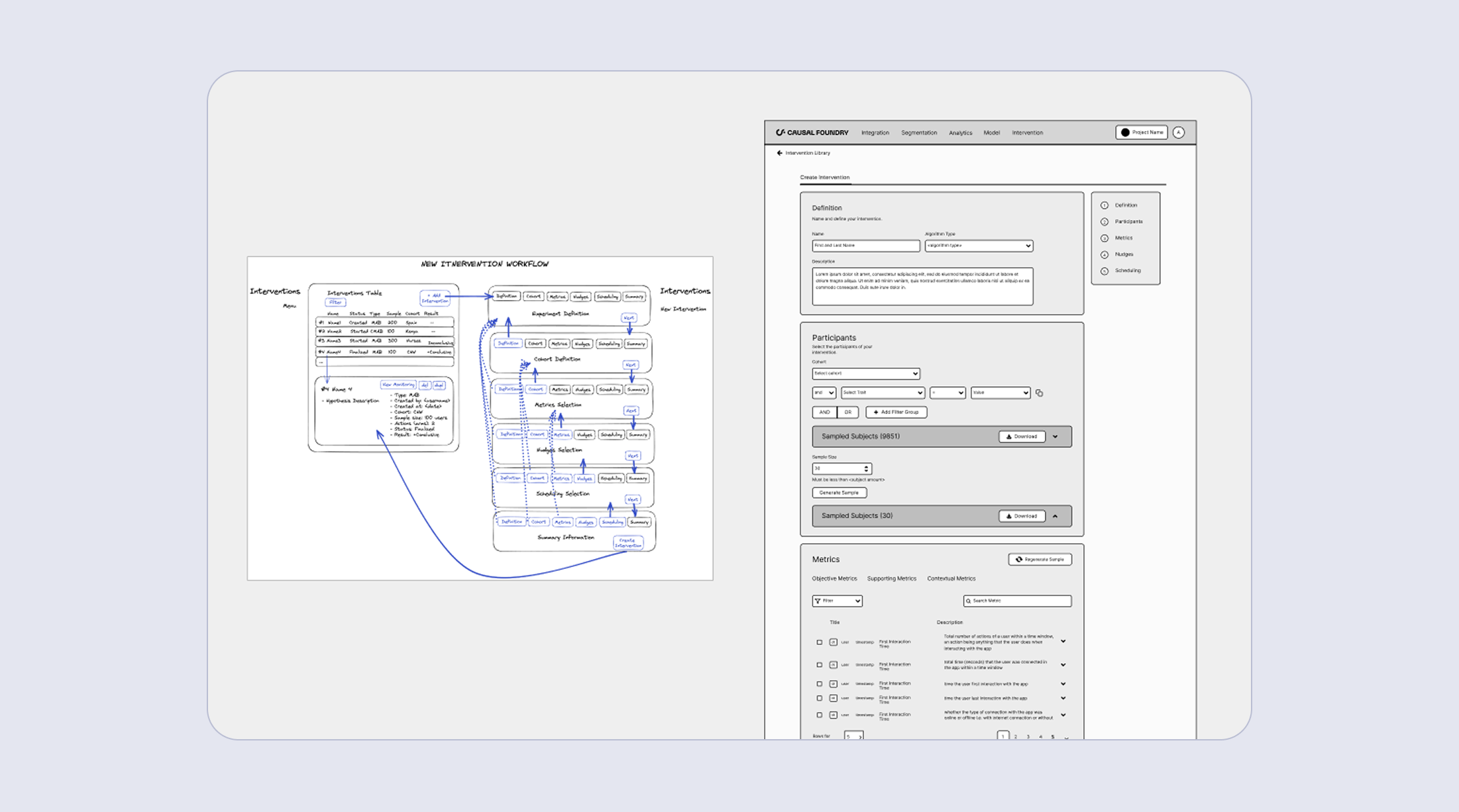
Intervention workflow wireframes iterated with partners
I designed a scalable chart and visualization framework that balanced usability, visual clarity, and build feasibility.
Design Process
Standardized chart anatomy across the product.
I introduced a shared structure for titles, axes, labels, legends, tooltips, annotations, and states so users could interpret any chart consistently, regardless of which view they were in. This reduced cognitive load and made the platform feel coherent rather than assembled piece by piece.Designed for real-world data conditions, not ideal datasets.
Working closely with data scientists, I built patterns for missing values, sparse data, outliers, and extreme ranges so charts explained what was happening and gave users a path forward, rather than just rendering faithfully and leaving interpretation to the user.Negotiated interaction scope with engineering
Some behaviors were costly to build. Rather than advocating for everything, I mapped interactions by user impact vs. build cost and used that to drive a prioritization conversation. We shipped the high-impact interactions, simplified the rest, and explicitly documented the deferred ones so nothing got lost between sprints.Built reusable building blocks, not one-off screens
Every chart was designed as a composable component with modular layout, responsive interactions (tooltips, filters, zoom, legends), and states for empty, loading, and error conditions. This meant the product could expand in future sprints without relitigating the same design decisions each time.
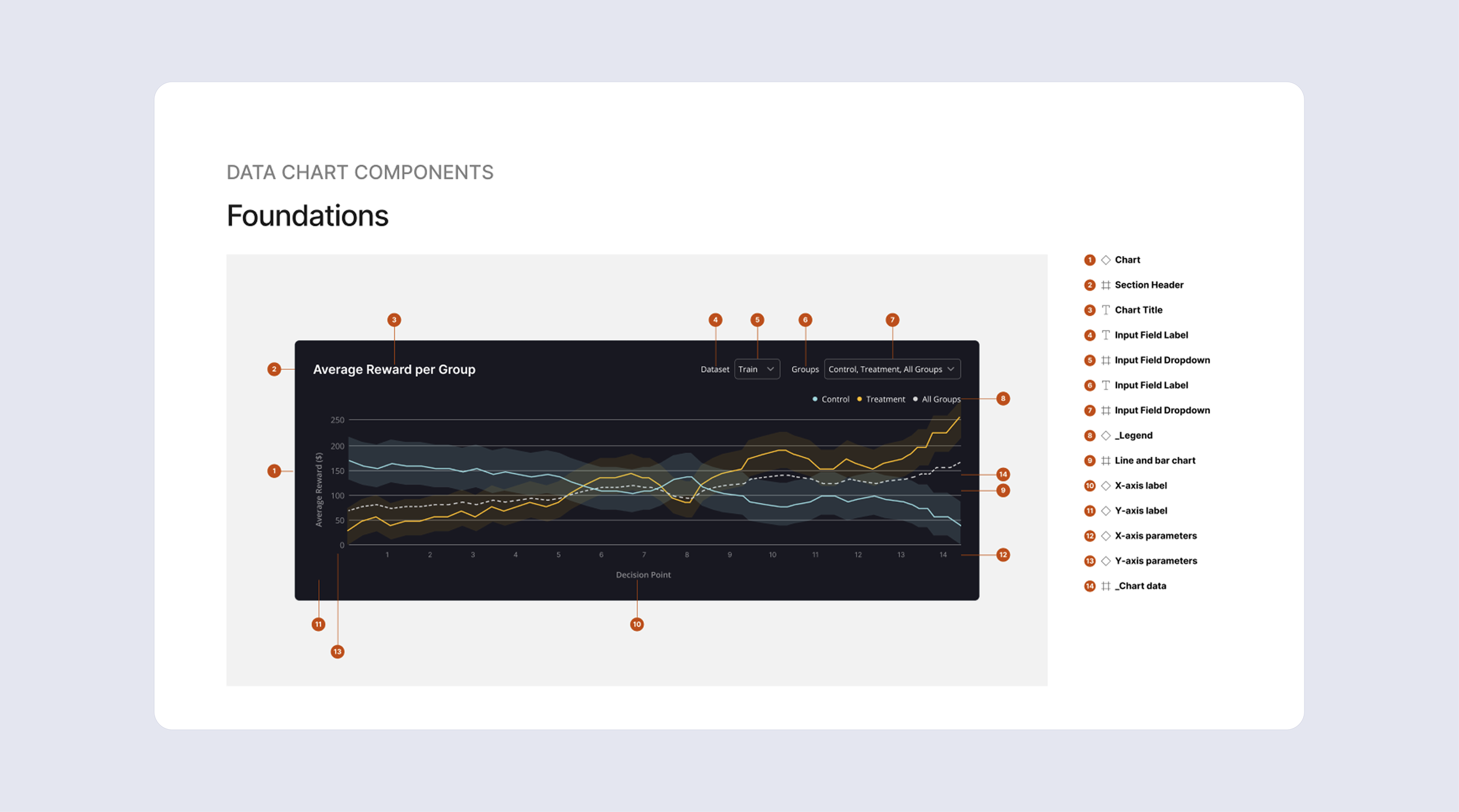
Foundation and specs of a data chart component
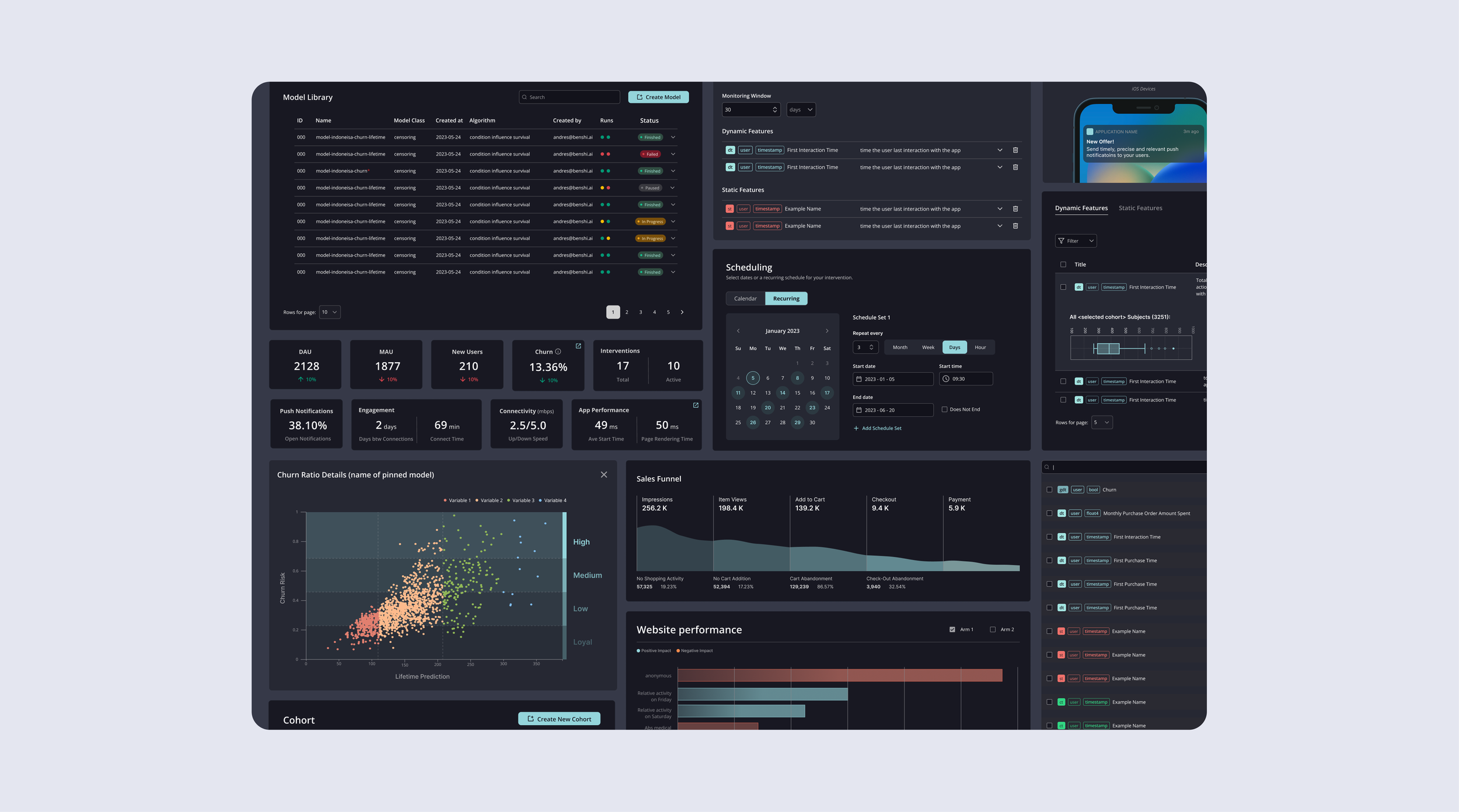
Design system snippet, charts and tables
For end users, reliable and clearly presented data built trust, reduced the learning curve, and supported faster, more confident decision-making.
Outcome & Impact
Shipped the first version of the analytics platform from scratch, including a reusable chart framework and component library. Standardized across 10 chart types and 5 core product surfaces, with consistent interactions and complete empty, loading, and error states. The MVP scoping call held: advanced customization and niche chart types were deliberately deferred, and the team shipped cleanly without accumulating design debt.
Shipping speed
New dashboard views went from 2–3 weeks to 2–3 days by reusing components and patterns across the system.Consistency
Standardized chart anatomy and interactions across 10 chart types eliminated design and implementation rework between sprints.User experience
Improved readability and reduced friction when switching metrics and views — reflected in fewer support questions from NGO partners during biweekly demo sessions and faster task completion in observed testing.
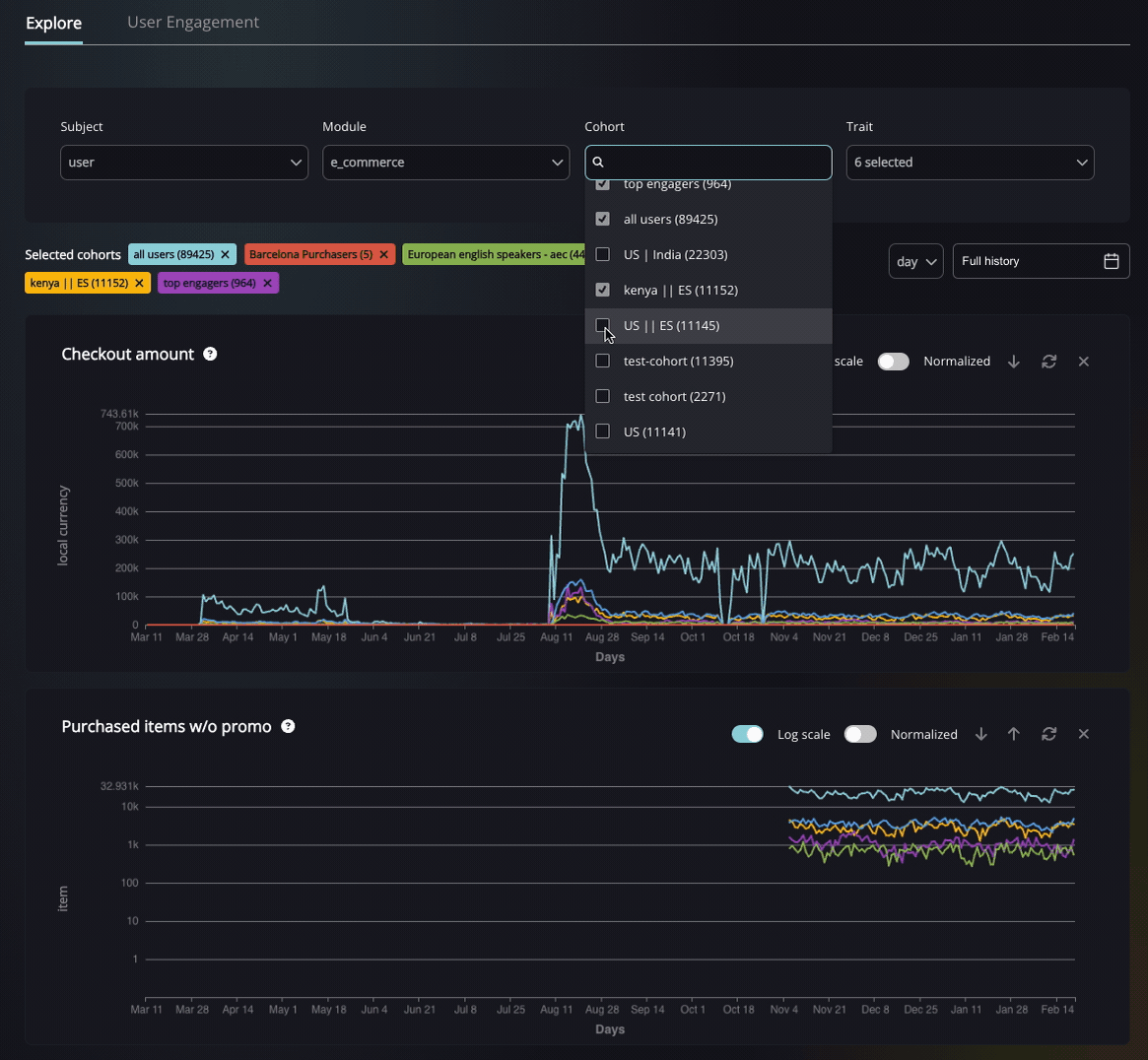
Complex use case of line charts and filters