A mobile-first booking experience that makes complex reservations feel clear and accessible.
↑
task completion across all critical booking flows in testing
↓
errors and confusion at vehicle type selection (the highest drop-off point)
2×
product surfaces: passenger app and ops manifest redesigned together
Client
Port Jefferson Ferry
Year
2021-2022
My Role
Senior UX Designer
Team
1 Design director
1 Brand designer
Development team
Timeline
20-24 weeks
Overview
Port Jefferson Ferry is a long-running service connecting Long Island and Connecticut for both passengers and vehicles. As ridership grew and booking needs became more complex, the existing online flow became difficult to use, especially for customers booking vehicles or special cases.
As a Senior UX Design contractor working directly with the Design Director, I led UX the research and end-to-end design for the mobile-first booking experience as well as the operation and admin experience for the ferry controllers. I facilitated interviews, journey mapping, and persona development, then translated findings into a guided step-by-step flow. I partnered with the ferry team and engineers to ensure the solution could scale to complex vehicle reservations and operational constraints.
The Problem
The existing booking process was manual, error-prone, and dependent on offline coordination between passengers and staff. Passengers couldn't reliably check availability, manage their bookings, or arrive at the ferry knowing their journey was confirmed. Staff were managing manifests by hand, creating last-minute scrambles when passenger and vehicle counts didn't match expectations.
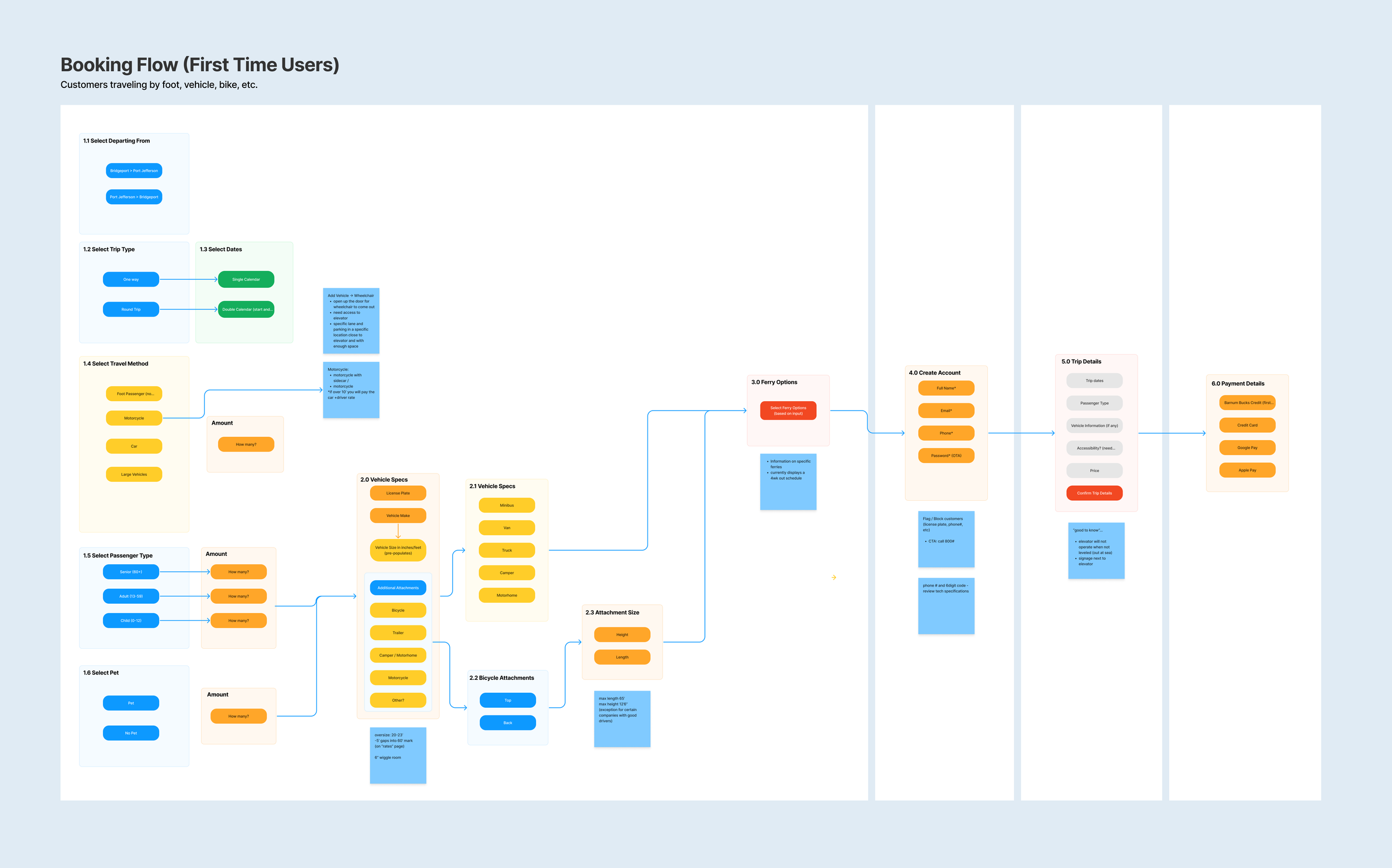
The core design challenge wasn't just digitizing a manual process — it was understanding where the process broke down and why. Early research revealed that the highest drop-off wasn't at payment or confirmation: it was at vehicle type selection. Passengers didn't understand the categories, guessed wrong, and either abandoned the flow or created boarding errors that the ops team had to resolve in person. That single insight shaped the entire structure of the booking flow.
Users
Passengers ranged from regular commuters who knew the route well to first-time travelers navigating an unfamiliar booking system. Both groups needed a flow that was fast to complete and impossible to misread at critical decision points; especially vehicle type selection, which had the highest error rate in the existing process.
Operations staff managed boarding logistics under real time pressure — passenger counts, vehicle assignments, manifest accuracy — often with limited time between scheduled departures. Their tool needed to surface the right information instantly and handle exceptions without requiring workarounds.

Customer and operations journey mapping
First-time-user flow mapped to reduce confusion and front-load reassurance
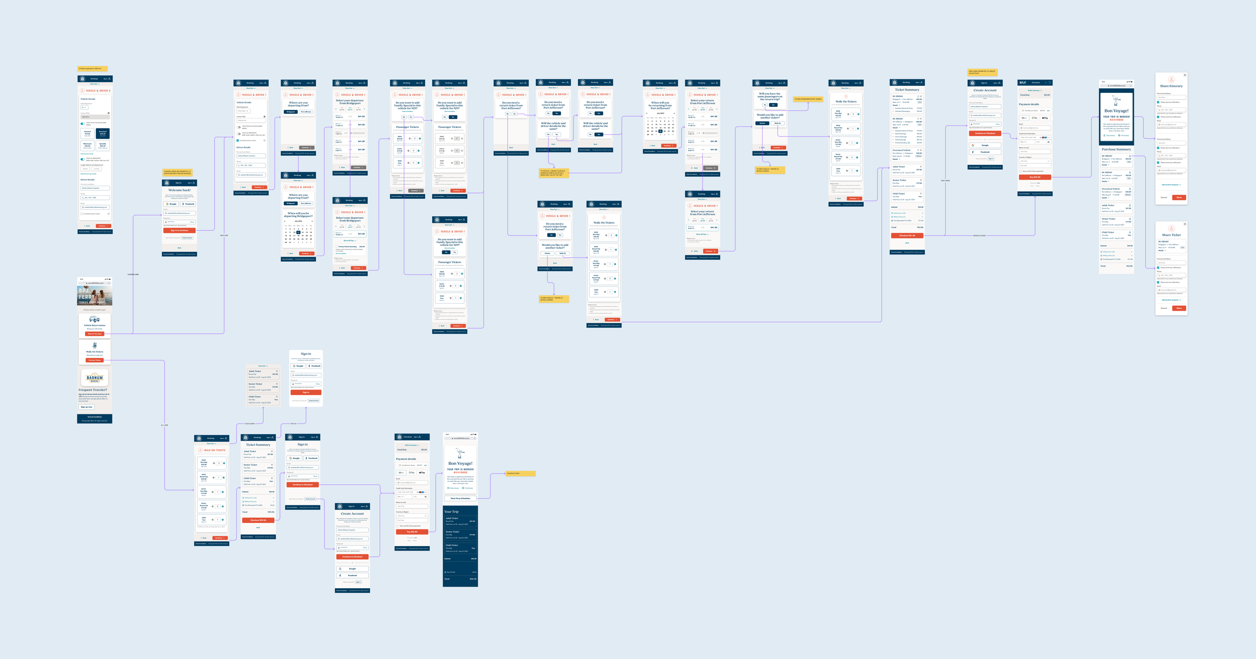
End-to-end booking workflow designed to scale across reservation types
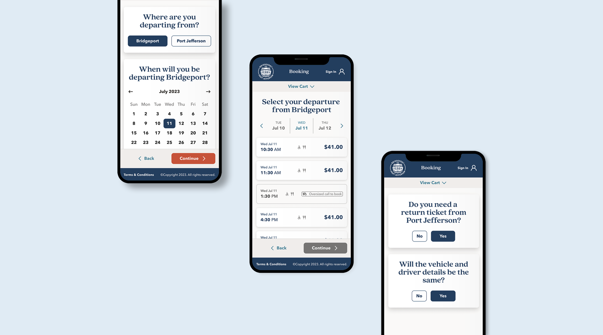
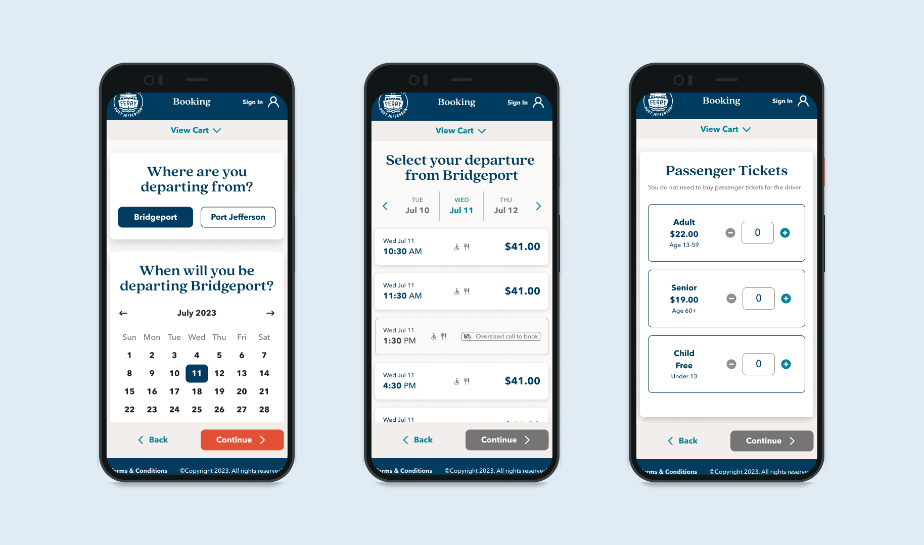
I restructured the booking experience around a guided, progressive disclosure flow that reduced cognitive load.
Design Process
Research and strategic framing
Facilitated research across both sides of the experience
I ran interviews and journey mapping sessions with both passengers and ferry operations staff — not just to understand pain points, but to identify where the two experiences created friction for each other. That cross-side view shaped the design brief: fixing the passenger flow without improving the ops manifest would just move the problem downstream to the dock.
Used journey mapping to align stakeholders on scope
Before any UI work, I ran a facilitated workshop using the journey map to get the client and operations team aligned on which problems to prioritize. This wasn't just a research output — it was a stakeholder alignment tool. It gave the team a shared picture of where users were failing and why, which made scoping decisions faster and less contentious through the rest of the project.
Passenger booking app
Applied progressive disclosure to reduce decision overwhelm
The original flow presented every booking option upfront, which overwhelmed users and led to errors at vehicle selection. I restructured the flow using progressive disclosure — surfacing only what was needed at each step, with contextual guidance at the vehicle type screen specifically. Usability testing confirmed this reduced errors and improved completion rates at the highest drop-off point in the original flow.
Designed for first-time users without slowing down repeat users
Contextual tooltips, visual cues, and in-flow guidance were designed to be present when needed and invisible when not — so a first-time user could navigate confidently without the experience feeling patronizing to someone who'd booked the route twenty times. Repeat booking and account management flows were optimized separately to reduce steps for returning users.
Operations manifest tool
Designed the manifest tool around real operational workflows
Staff interviews revealed that the hardest part of boarding management wasn't viewing the manifest — it was handling exceptions quickly: last-minute additions, vehicle changes, and passenger discrepancies under time pressure. I designed the manifest tool around those scenarios specifically, with fast search, clear status hierarchy, and structured exception handling built in rather than bolted on.
Closed the loop between passenger and ops experiences
Every booking decision a passenger made — vehicle type, passenger count, scheduling — had a downstream implication for the manifest. I mapped those dependencies explicitly and made sure the two surfaces stayed consistent: what the passenger confirmed matched what the staff saw, without reconciliation steps in between.
Progressive disclosure pattern that reveals complexity only when needed
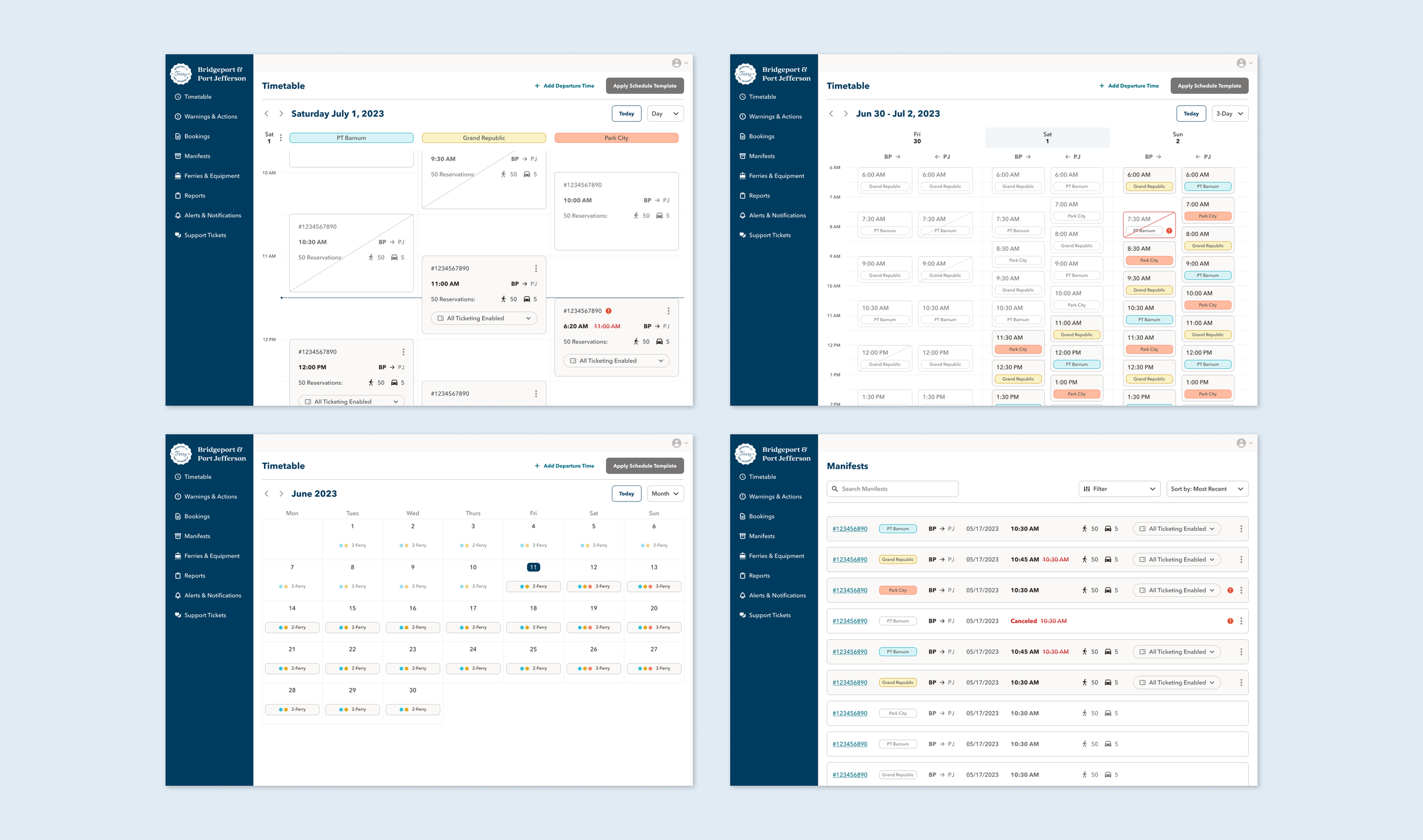
Ops timetable views help staff plan, edit, and spot changes quikly.
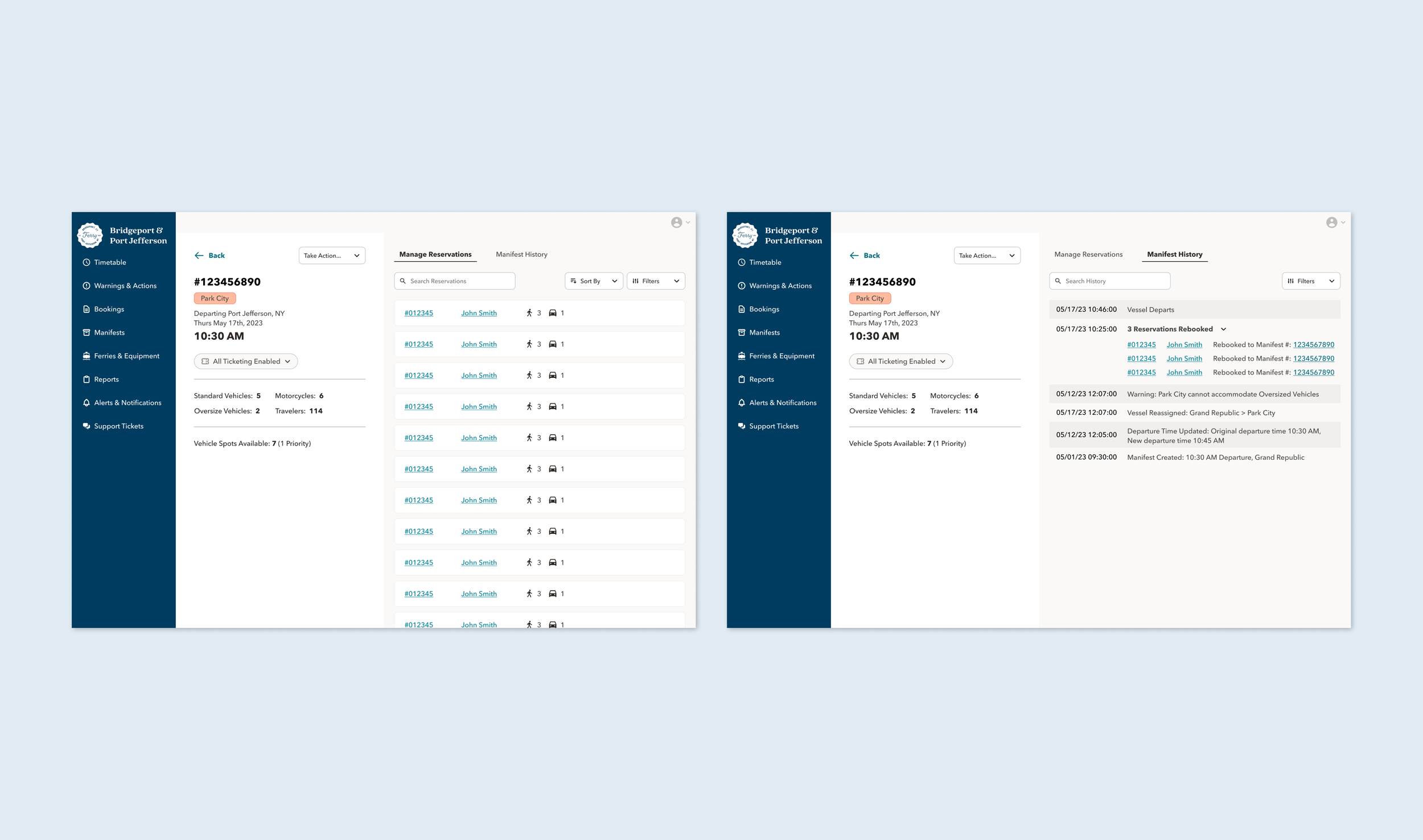
Manifest management view keeps capacity and departure context visible while staff manage reservations
Outcome & Impact
Delivered a validated passenger booking app and operations manifest tool, both grounded in research across both sides of the experience. The passenger flow redesign addressed the highest drop-off point directly — vehicle type selection — through progressive disclosure and contextual guidance. The ops manifest gave staff a reliable, exception-ready tool that stayed consistent with what passengers had confirmed. Both surfaces were tested and validated before handoff.
Completion:
Task completion improved across all critical booking flows in usability testing, with the clearest gains at vehicle type selection — the step that had driven the most errors and abandonment in the original flow.Errors reduced:
Progressive disclosure and contextual guidance at vehicle selection measurably reduced confusion and input errors in testing — the problem that had been creating downstream boarding issues for operations staff.Clarity:
Post-test feedback showed clear improvements in how easily users understood the booking flow and what was expected of them at each step — a direct result of restructuring the information hierarchy.Research depth:
Dual-sided research and stakeholder facilitation produced a design brief grounded in real operational constraints — not assumptions — and kept the team aligned on priorities through the full project.